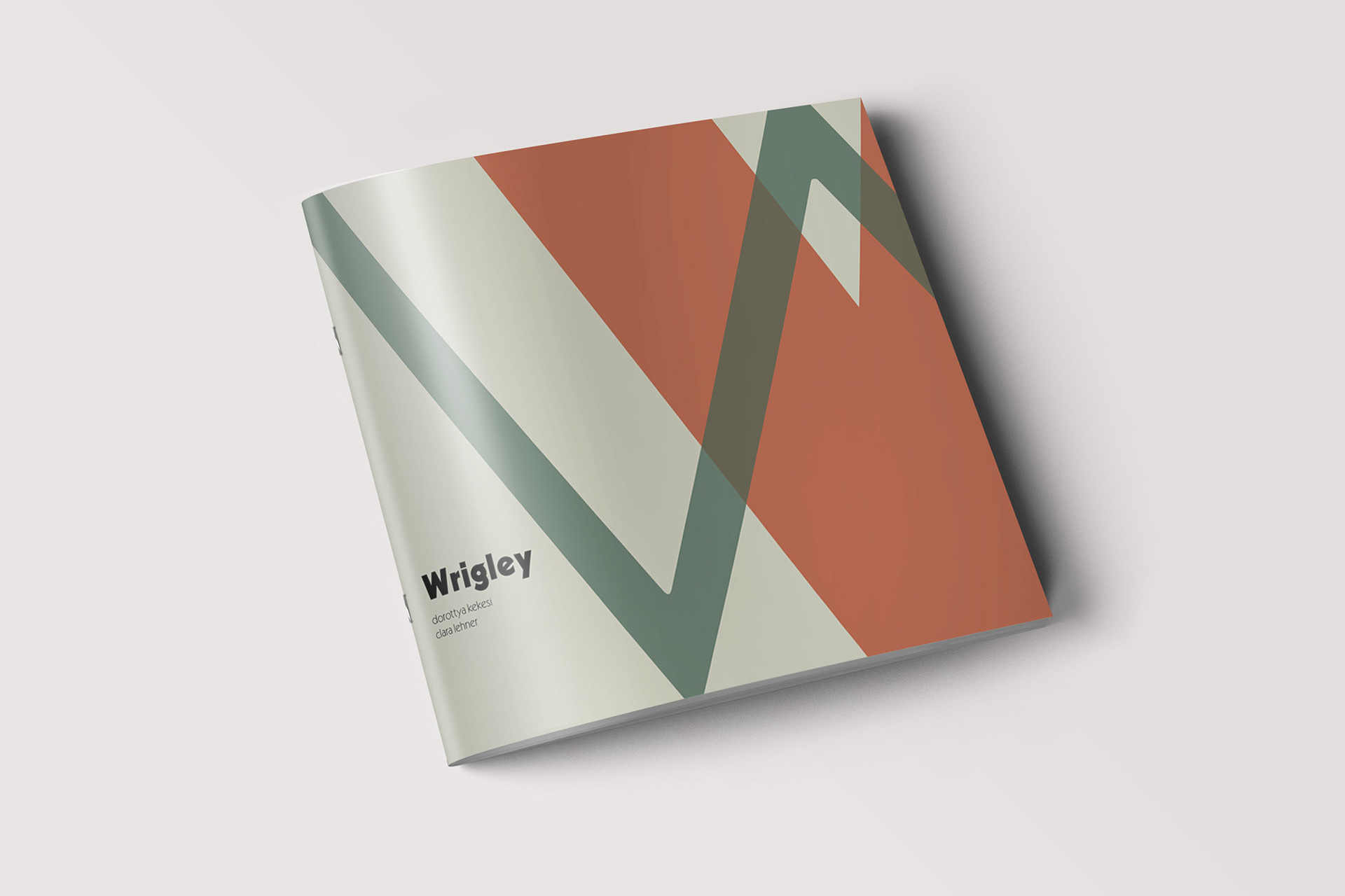
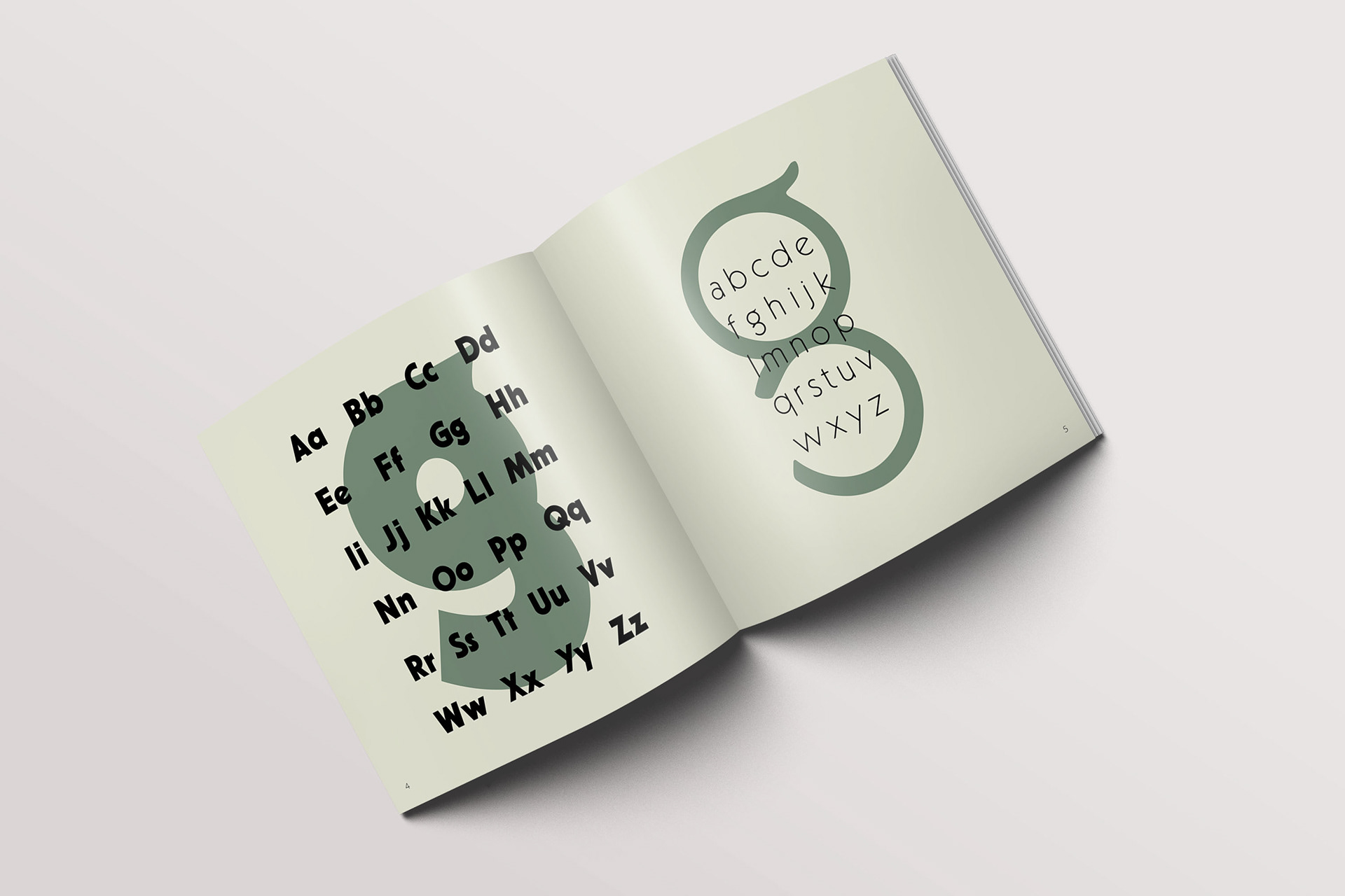
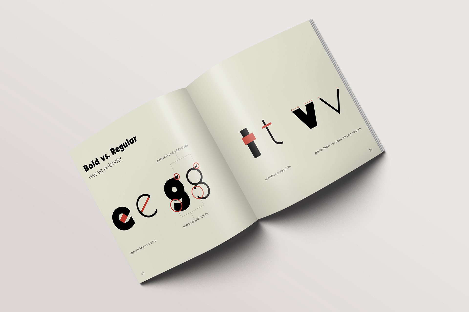
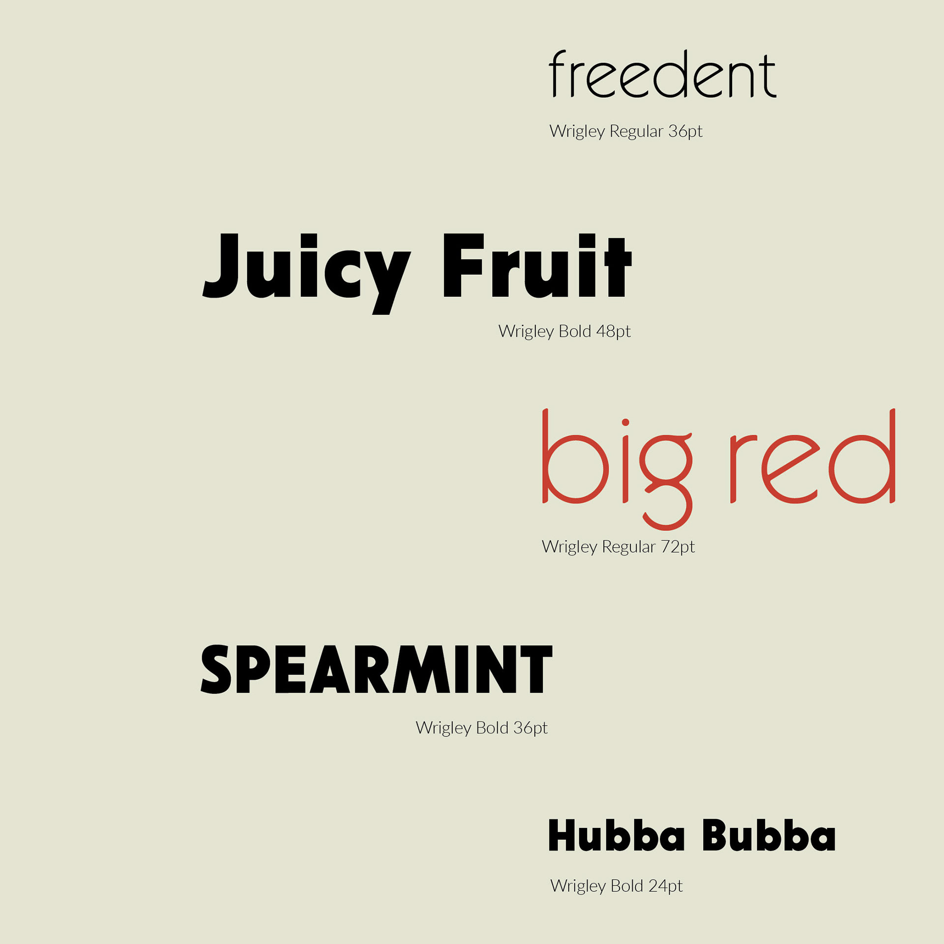
We found the inspiration for our type design on an old chewing gum vending machine. The mixture of geometric grotesk and fancy elements aroused our interest. We found the combination of Bold and Regular especially appealing, so we decided to elaborate both typefaces.
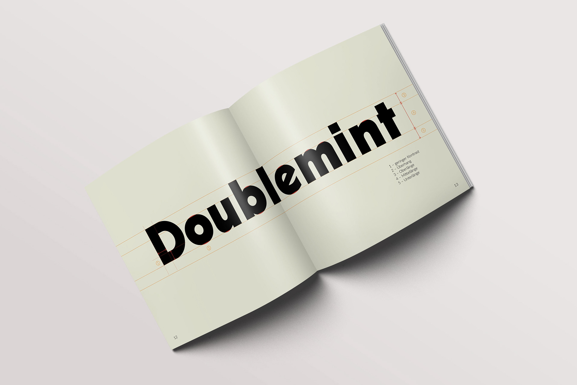
Wrigley is a sans serif font and can be assigned to geometric fonts. However, special elements give it an extraordinary character. A recognition value. The diagonal crossbar in the e, the shape of the g and the rounded terminals in the Regular give Wrigley a unique liveliness.
This project was made as part of the seminar Typography at university. Credits to my project partner: Clara Lehner.